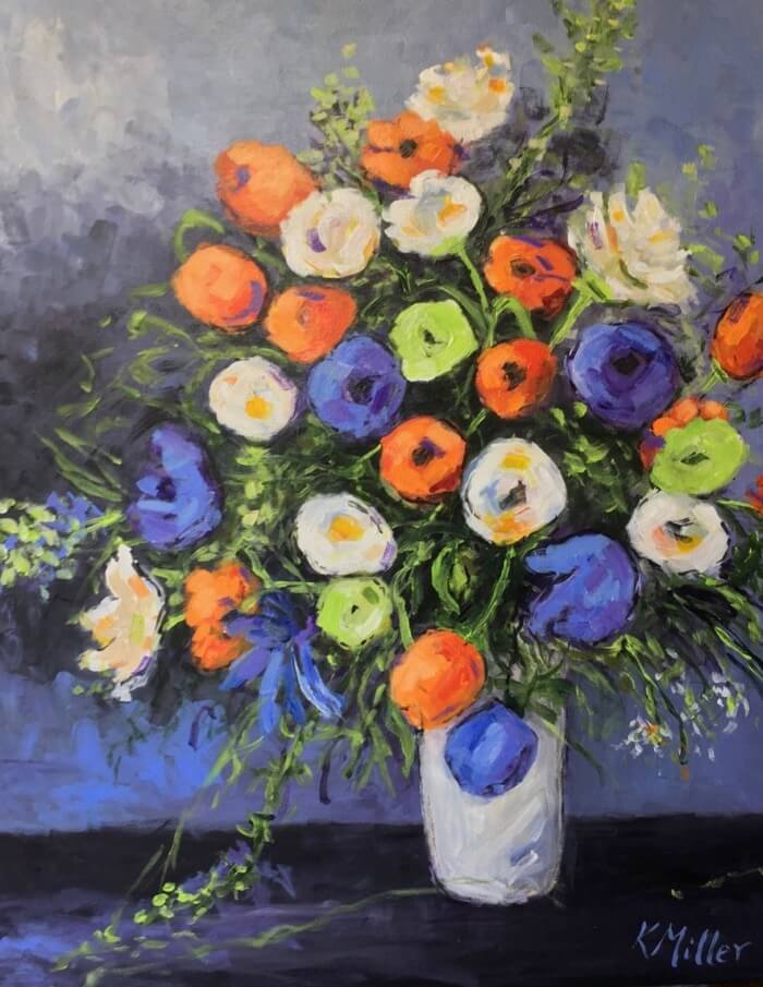
Opposites attract … A familiar adage to most people. In traditional color theory, opposite colors on the color wheel are complementary. They look good together. Red and green as in Christmas. Purple and yellow as in LSU Tiger colors or blue and orange as in Florida Gator colors.
I love the color Orange! (Must have something to do with my Tennessee Vols Orange and White). But seriously, I think orange is a very important color in a painting. It enhances the red shades, making the reds warmer and more vibrant. Orange looks great with blues and greens, yellows and purples. It plays a part in many of my paintings, especially my tailgating series.
Many of my flower paintings center around the pinks, peaches, yellows and greens. I wanted to do a series featuring orange and a variation of the triad color theory … colors evenly spaced around the color wheel.
I chose a vivid orange, combining flowers in purpley blues and a variation of greens, especially lime green.
I thought you would like to see my painting process on this painting …”Opposites Attract”.
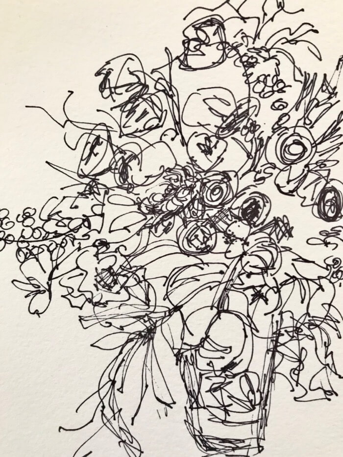
Step 1 … I begin with a pen and ink sketch on water color paper.
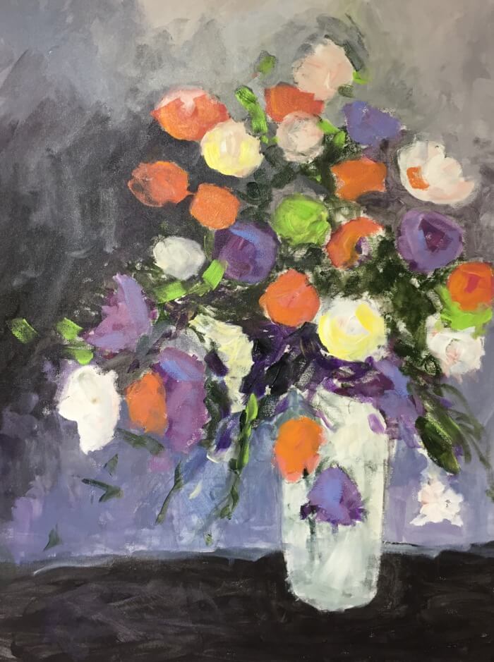
Step 2 … Get the paint on the canvas … I casually sketch and then apply paint to cover the canvas. When it is dried I coat with a varnish to add depth.
Step 3 … Reapply paint to the entire canvas … adding texture and color. Add another coat of varnish for richness and depth.
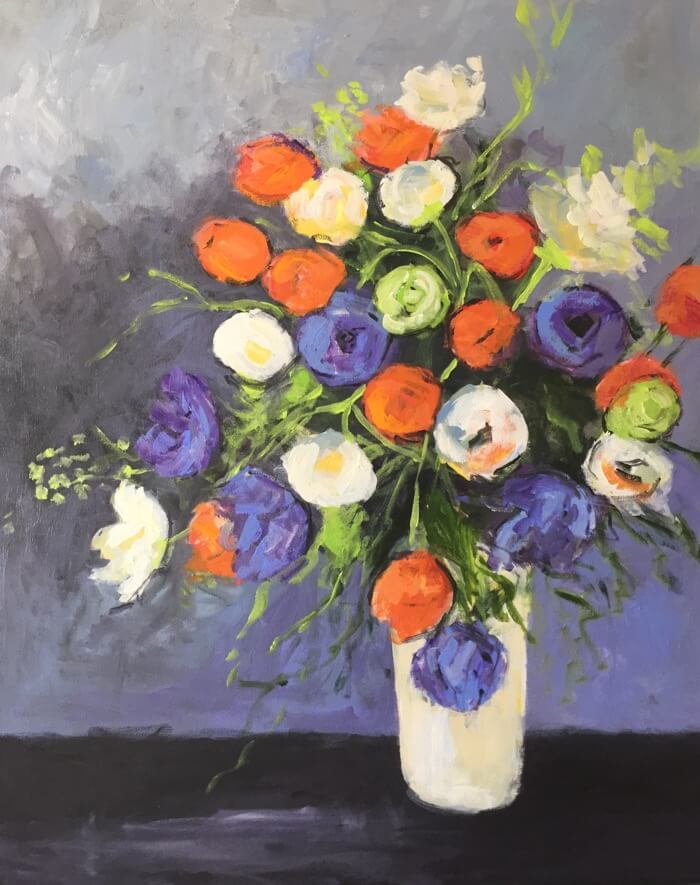
Step 4 … Here we go again…add paint and texture … adjusting colors and line … There may be several layers added over the next few painting sessions.
Sign and finish with a final coat of varnish!
24″x30″ Acrylic on Canvas $1,200.00

TRIAD COLOR THEORY
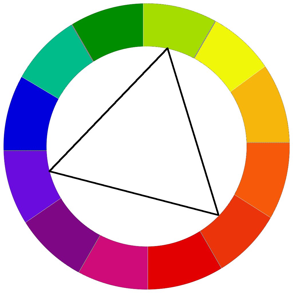
AND NOW FOR THE FINAL PART OF THE TITLE…IF A PAINTING COULD TALK…
The story behind this painting…
“Trailing Kumquats” or “If A Painting Could Talk”
22″x28″ Acrylic on Canvas. $1,100
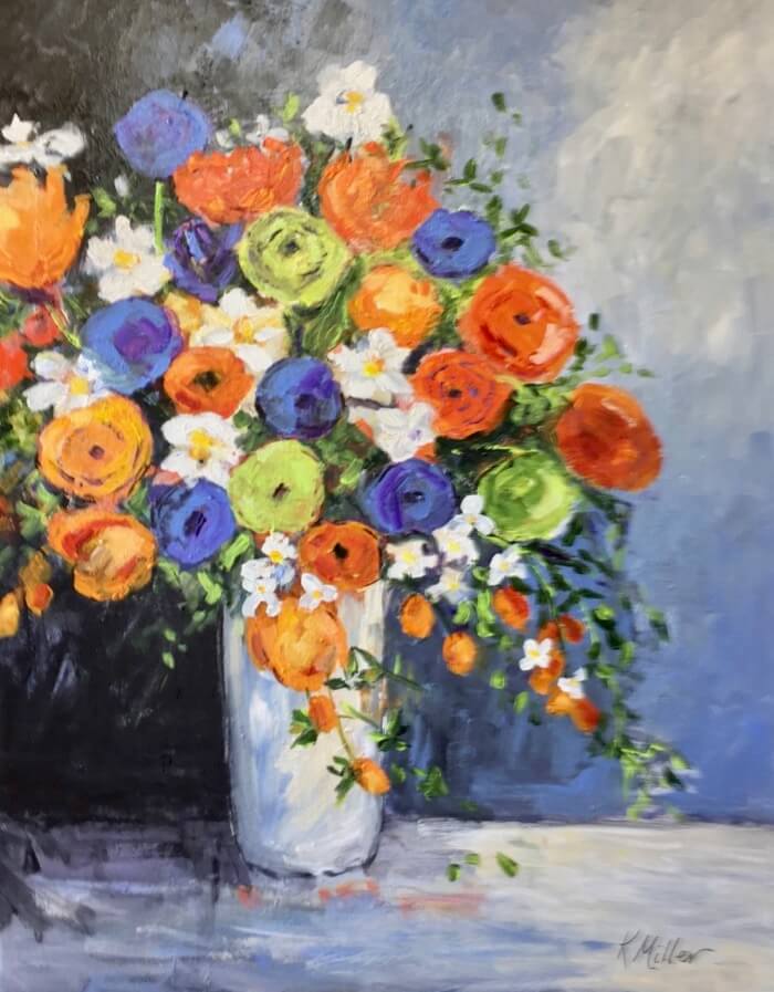
This painting would definitely be the most expensive one in my gallery … if one’s time and effort were figured in the price. The artist’s mental block, or writer’s block, or painter’s block … all the same thing.
I began this painting using a photo I had seen with kumquats … one of my favorite garnishes and decorating fruits at Christmas. As mentioned earlier I love orange and thought this would make for a great painting. I sketched, painted, varnished, and just hated it. The colors were too orange and white. The background was too stilted.
I placed the painting on my studio wall (as I do with all finished and unfinished works). I stared and stared at it. For weeks … if not months.
Every time I would begin a new painting or series, “It” was always staring back at me.
After much thought, I tried again, toning down the oranges, making the composition more pastel …. IT was bland!!!
I put IT back on the wall.
IT remained on that wall eyeing me until I had the ah ha moment!
I had almost finished the Opposites Attract painting. I just knew this one would be perfect using the same triad color theory.
IT didn’t take long to invest new life into the kumquat painting … If A Painting Could Talk!
Both paintings are entered in the Amelia Island Club Art Show … March 23 and 24, 2018.
Available for sale here in art gallery … friends and family discount will apply for Art of Living Subscribers.
Come celebrate with me. I’ll save you a seat at the table or easel.


8 Comments
You are so talented!! Enjoyed reading about the process! My kitchen is now a Kathy Miller gallery with three of her original paintings.
Thanks Jane! So happy you are one of my best customers! Enjoyed painting the ones you have too. Still some of my favorites. As I have said before, they are like children. Hard to let go, but happy someone as nice as you have them.
Kathy,
Thank you for showing the evolution of the piece and your thought and time process as it developed. I really enjoyed and learned from both!
Thank you Jo-Ann. It means so much coming from you with your understanding of creativity and the design process.
When Kathy said her next painting would be titled “Opposites Attract”, I was afraid she was doing a couples painting of us. Very relieved she was referring to colors. Orange and Blue works well for me.
Our painting is coming up next!
Kathy,
I also enjoyed a glimpse of “the” process and imagine your two paintings will have new homes in a couple of days.
Kudos also to Dave for his clever blue and orange comment.
Have a fun weekend with the show!
Susan
Thanks Susan for always reading the blog and for your right on comments!